
The Brand Story
Creating a brand isn’t something that just happens and especially creating a sporting brand is even harder. The ownership of B.A.F.C. ultimately knew the most important aspect was to focus on the club’s mission “to unite our region through soccer” and let that guide them. To us, our region is what drives us. It’s who we are and what makes us so unique. Our area is rich with history, and that is where we began.
It was a long process where icon names ranging from various woodland animals to liquor making outlaws and bootleggers to our NASCAR roots, but ultimately the heart of the region won…
Bristol is synonymous with its roots and the role it played in the history of Country Music. Moreover, the way that music galvanized a region and united them in good times and bad. The music tells the story and we wanted to honor that story…
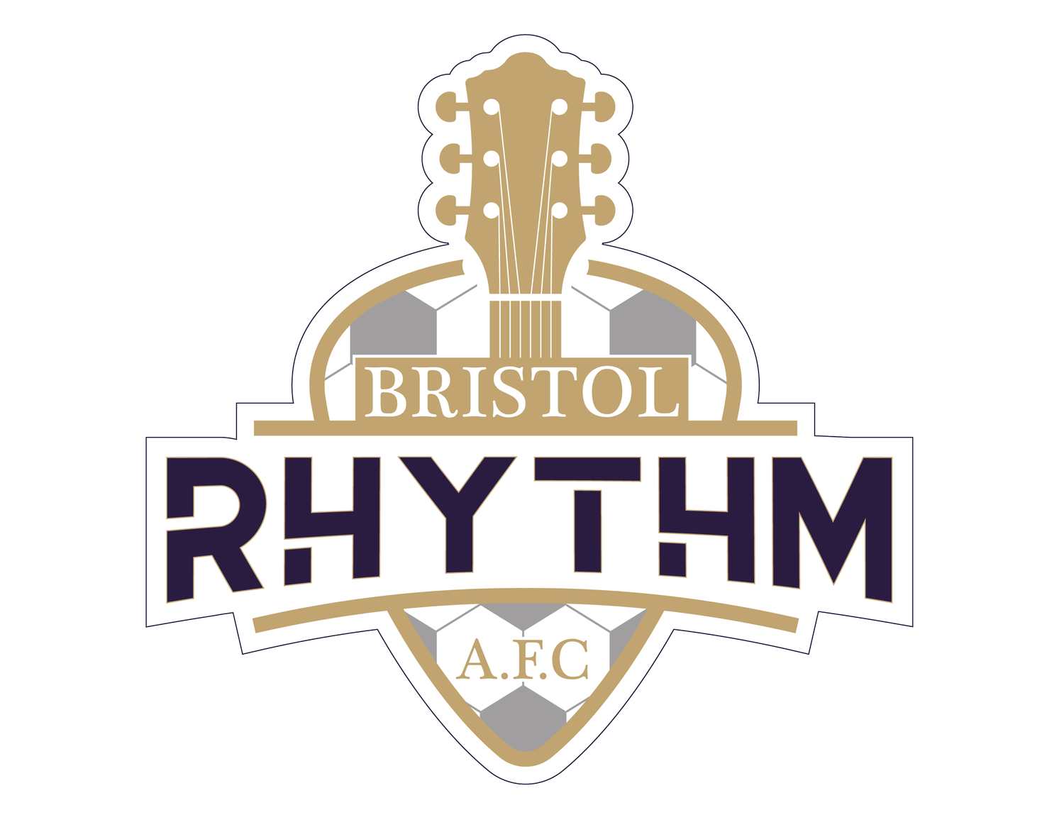
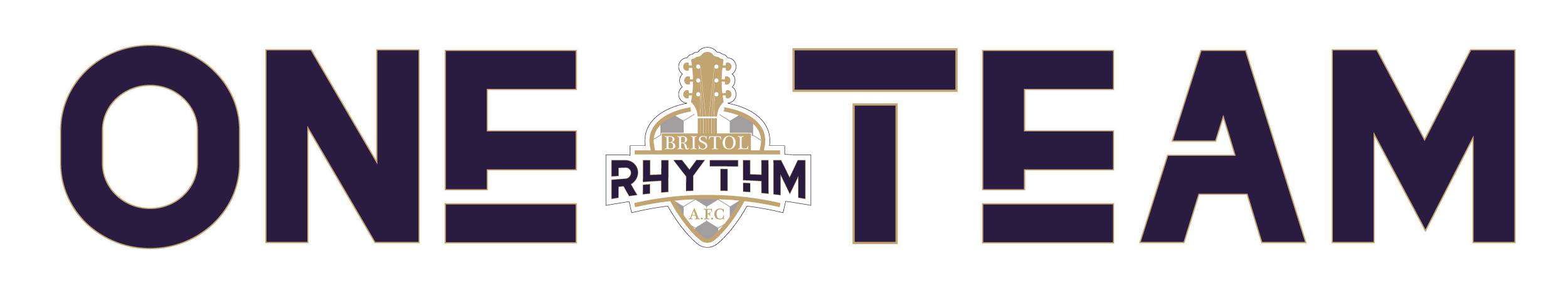
The Rhythm of this region is well known. Oxford defines Rhythm as “the systematic arrangement of musical sounds, principally according to duration and periodic stress.” What defines Appalachia more poetically than that? Our region, our community, coming together to play as one… the Rhythm of Appalachia. The Rhythm of a soccer team moving around the pitch as one… We knew that we had found our name. We also found our Motto during this process: “One City. Two States. ONE TEAM."
Iconically, the process started by collecting important pieces of that musical history. The giant guitar on main street, the simple badge shape of the guitar pick, the road markers that unite State Street, Records signifying the Bristol Sessions, The five lines of a stanza…. All these iconic pieces that are part of our history.
Once the icons were established the color palette was the next step. Using a color palette generator we took the most iconic piece, the record label, and ran it through the algorithm. It brought back various shades of black and gold, both strong athletic colors with great meaning.

Surprisingly though it showed the most beautiful color of purple. Purple is associated with “Creativity” and “Imagination” in color psychology and what music is well defined by those attributes. Purple is also associated with “Royalty” and what team doesn’t want to be the king of their league and carry the gold. So there we have it, our team colors defined by one of the most iconic pieces of Bristol history.
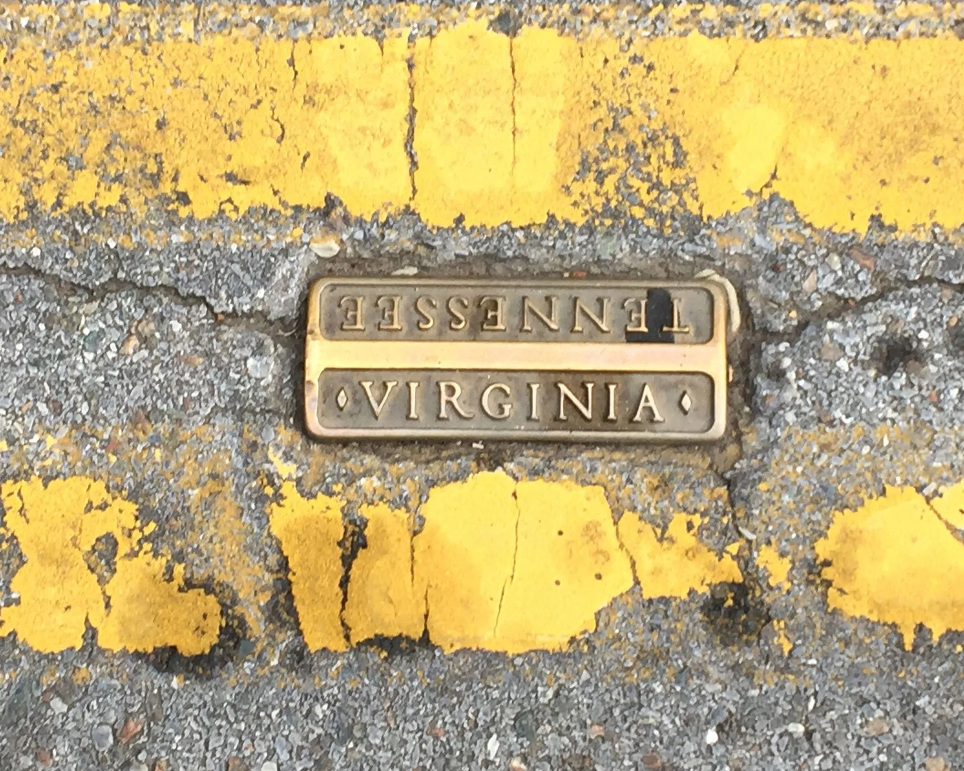
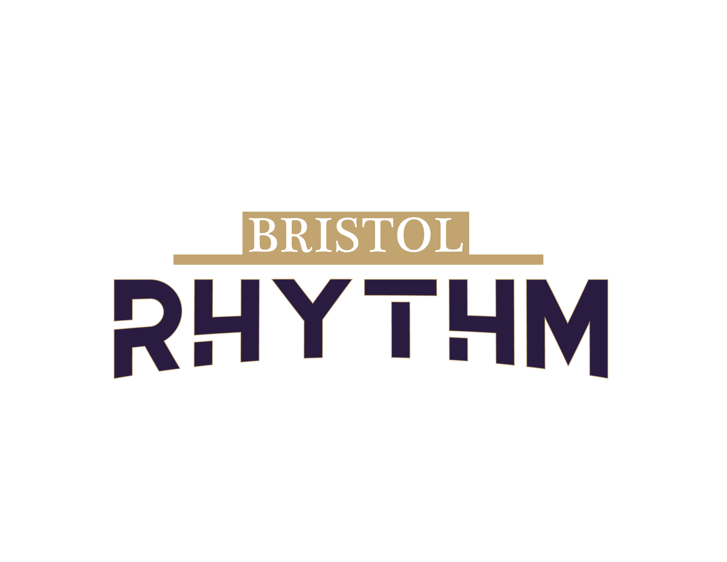
Moving on, type was the next important piece and again… we let science define that for us. One of the most memorable things about Bristol is how State Street is divided into its Tennessee and Virginia halves. So important, it is marked by bronze markers. We wanted to honor those markers not only somewhere in the logo, but also that iconic typeface. That is where the block “Bristol'' in the logo comes from. It honors these markers.
For our next font, we wanted something that paired well with this traditional, but antique style serif font that was in a word - futuristic. We wanted to combine the old and new to showcase the future of the region. Not only our personal goals with soccer, but the progress being made everyday by our community leaders to grow our region. After many… many… many fonts… we finally found our team font and the wordmark was founded.
Assembling the logo was much more trial-and-error than expected, but in the end… with the clock running out in extra time… our badge… our shield… the Bristol Rhythm was born. We are proud of the way our name, our motto, our logo all represents our region.
We stand to showcase the best parts of our region across the country and be a standout club in the NPSL. Please continue to learn more about Our Mission, Our Vision and Our Soul.